Exploring QuiXoT features
Here we describe some of the features of QuiXoT you can use in everyday's work analysing quantitative proteomics experiments. If this is the first time you run the program, you might be interested first in checking the unit tests for QuiXoT.
Contents
Analysis 1: 18O, HR
We will check some features using the 18O experiment using high resolution spectrometry, which we can see in the Test 1 of the unit test. If you didn't generate the QuiXML file (including quantification and statistics) following those steps, you can use the file VSMC_QuiXML_bs_quant_stats.xml in the VSMC_result folder (remember to move this file together with the binStack if you want to see the spectra; or just use the QuiXML alone if you do not need them).
1.1 Getting started
After downloading QuiXoT (find the latest release in the specific article) and the files for the experiment from test1_full.zip, unzip the files and open QuiXoT.exe.
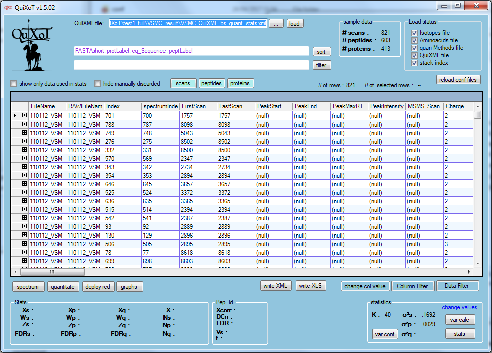
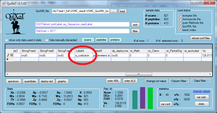
Drag and drop anywhere on its window the abovementioned QuiXML file, and select the 18, HR, SEQUEST strategy. You should see this window:
1.2 Managing spectra
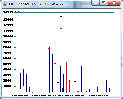
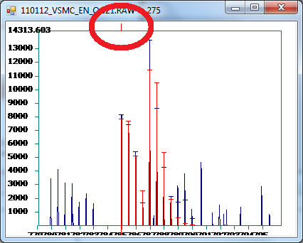
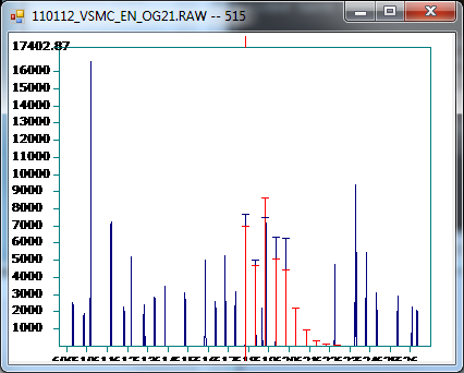
We might want to start checking how are the spectra (if you did not copy the binStack, you can skip this and go to generating graphs). Click on button spectrum, and then click on any row in the datagrid. For the fourth row (with FirstScan = 8502) you should see something like this
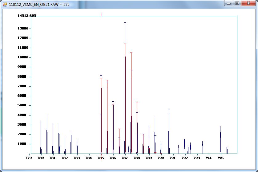
The experimental spectrum is drawn blue colour, while the red colour is the theoretical prediction (taking into account the peptide sequence, the isotope distribution, the labelling, and the labelling efficiency). The horizontal "lids" of the quantified peaks depict the tolerance used to consider if the theoretical peak matched (or not) the experimental one (note that there is a minimum "lid size" to visualise it). We can enlarge it to see better:
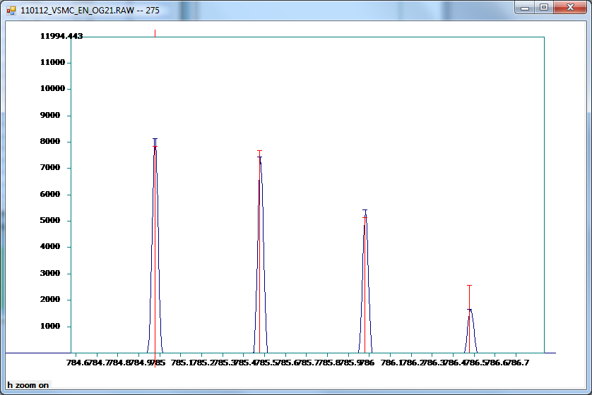
Or select the first four quantified peaks with the mouse (click and drag horizontally):
In this view we can see that apparently no co-eluted peaks are present.
Note that on the top of the screen we have an indicator of which is the precursor mass of the peptide that has been matched:
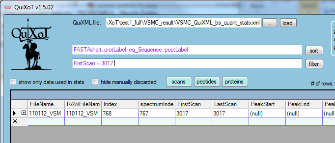
Let's look at a specific spectrum. To make it faster, we will filter the spectrum with FirstScan = 3017 (write the filter in the filter field and then click on the filter button:
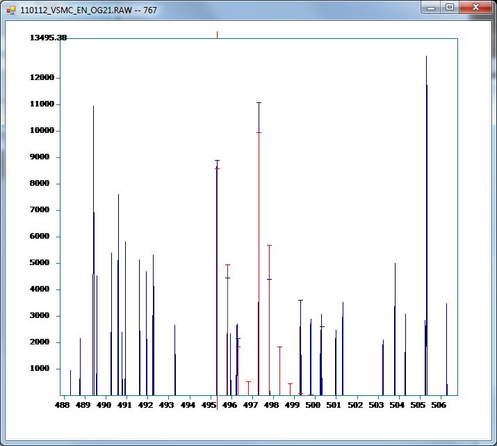
The open the spectrum, enlarge
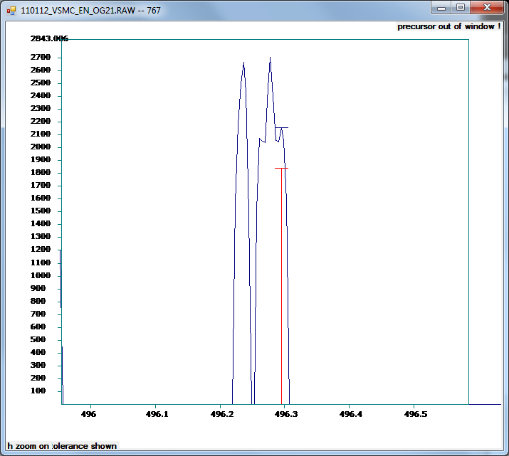
And then select the third quantified (red) peak:
(Note the warning on the top: the precursor is outside this window.)
This is a clear example of a co-eluted peak, so we can label the corresponding peptide to filter it out of the statistics later. We can go to the Label4 column, and directly write down s_coelution (or any other tag we prefer, as far as we can filter it easily later; starting the tags related to scans as s_, those related to peptides as p_, and those related to proteins as q_ is a good practice to distinguish between filters):
We can right-click on the spectrum to either zoom out or export data to a text file that can be treated by another software.
1.3 Checking information
Bottom left panels
Close the spectrum-window, and remove the filter in the filter field (delete and click on filter button).
You can see that in the bottom left corner there is a lot of information about every quantification. You can click with the mouse on any row, and go down with the arrow button: this information shows the data of each scan-peptide-protein of every row:
There are two panels, one for the quantitative information of spectra, peptides and proteins, and another with the identification information (prior to QuiXoT analysis). The details of this are explained in DataGrid information in QuiXoT.[1]
Central bottom bars
Next to these panels there are three bars with important information for 18O experiments:
It is easier to explain what they are showing by an example. For example, if we select the spectrum with FirstScan = 1492,
we see it looks like the non-labelled species (first sample) is slightly more abundant than the labelled one (second sample). However, QuiXoT analysis shows that in this spectrum, the labelling efficiency was f = 0.8989. This means that there is a 10% of peptides coming from the second sample which failed to be labelled, and hence are added up to the non-labelled peptides. Correcting this, QuiXoT assigns a A = 100,501, and B = 101,294, which leads to a ratio of 0.992 and a log2Ratio = -0.113 (so, actually the second sample is slightly more abundant than the first one).
A more extreme case is shown for FirstScan = 3041:
also here looks like the two samples are almost equally abundant. However, it seems that the identified peptide is very poorly labelled, with labelling efficiency f = 0.3925. This means that most of the peptide in the second sample has not been labelled, adding itself up to the first, non-labelled sample. The QuiXoT analysis shows that abundance in the first sample is A = 4775, and for the second is B = 28,740, so that the log2Ratio = -2.59.
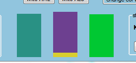
This is shown in the bottom-central bars:
The meaning of these bars is:
- the first bar (bluish green) shows the corrected abundance of the first sample,
- the second bar diplays the corrected abundance of the second sample, split in three colours:
- purple for the amount that has been fully labelled, i.e., with two 18O (both available 16O oxygen atoms in the carboxylic group have been replaced by 18O), so the labelled peptides have been added in the spectrum counts with a 4 Dalton separation
- yellow for the amount that has been partially labelled, i.e., labelled with only one 18O (only one of the two available 16O oxygen atoms in the carboxylic group has been replaced by 18O), so the labelled peptides have been added in the spectrum with a 2 Dalton separation (being superimposed to two of the non-labelled isotopologues)
- red, for the amount that has been fully non-labelled, i.e. despite the peptides come from the second sample, they are superimposed to the peptides from the first sample
- the third bar shows labelling efficiency, f, which is a ratio between 0 and 1; when f > 0.6, it is green colour, and when it is <= 0.6 it is red.
Bottom right panel
In the bottom right panel we have information about the statistical analysis:
Here we can see:
- the weight calibration constant K; we see we have used here the recommended value for these experiments (K = 40),
- the variances for each of the three levels taken into consideration:
- sigma2s for the variance of the spectrum level,
- sigma2p for the variance of the peptide level,
- sigma2q for the variance of the protein level.
This panel includes also controls for statistics:
- var conf, to calculate the limits of confidence of the variances,
- change values, to manually modify the variances and the weight calibration constant,
- var calc, to calculate automatically the variances,
- stats, to perform the satistics.
Top right panels
There are two small panels on the top right area:
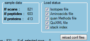
The sample data panel, as it can be seen, has information about the number of scans, peptides and proteins in the analysis.
The load status panel is for advanced users, and allows reloading specific files. The files for isotopes, amino acids and QuantitationMethods refer to XML configuration files present in the conf folder of QuiXoT.
Finally, there are three buttons in the middle of the main window:
They are especially useful in order for the display of spectra, peptides and proteins. By default all the spectra are shown, so in every row, peptides and proteins (and their associated information, such as Xp, Wp, etc) appear repeated as many times as needed. However, this might not be desirable when we want to focus on peptides or proteins. Pressing the peptides or proteins uses scan or peptide indices to select only the first scan of each peptide or the first peptide of each protein,
1.4 Handling graphs
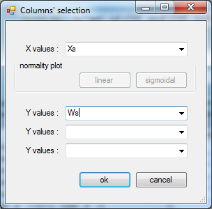
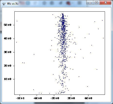
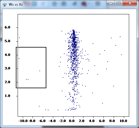
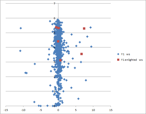
An interesting feature is the way graphs can be handled. We will start representing the spectrum weight (Ws) vs the log2Ratio (Xs). First, click on spectrum, and request the corresponding graph (don't forget to click on the scans button if you clicked on peptides or proteins in the previous subsection):
The resulting graph should be:
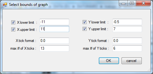
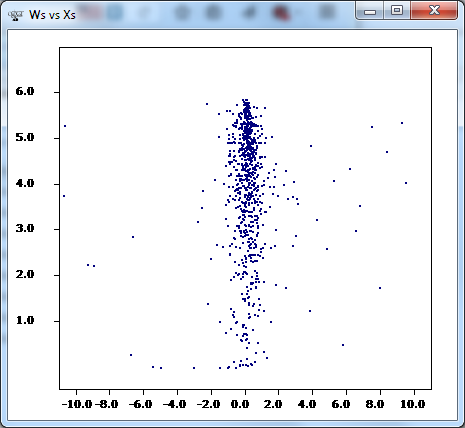
You might want to change some things. For example, centring the axis, or using a different notation for the axis. In this case, you can right-click on the graph, chose select bounds, and change the values of limits, X tick format and max # of X ticks to:
Then, we should obtain this:
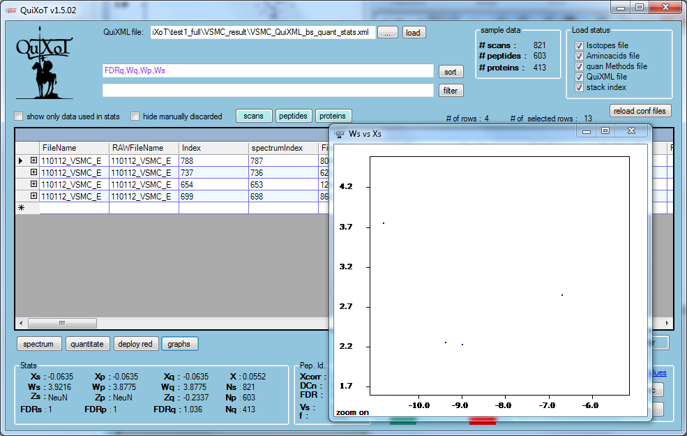
Now, let's assume we want to know to which spectra are associated the four datapoints in the middle left. We can select the corresponding area with the mouse to zoom it:
The data are automatically filtered in the datagrid, so we can examine them,
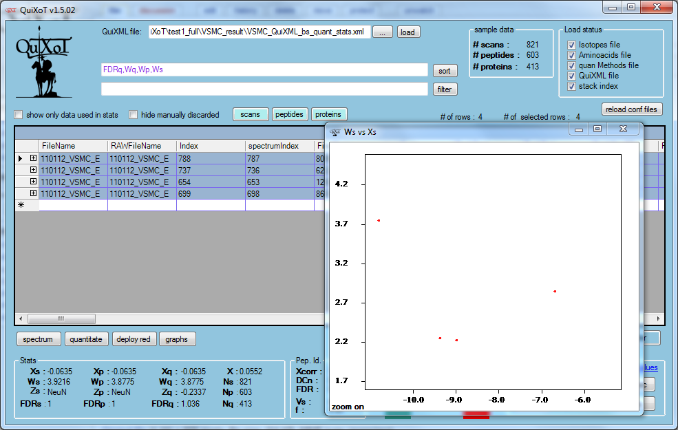
Now, we can select these four rows by clicking the top left corner of the datagrid; you will see the dots become red:
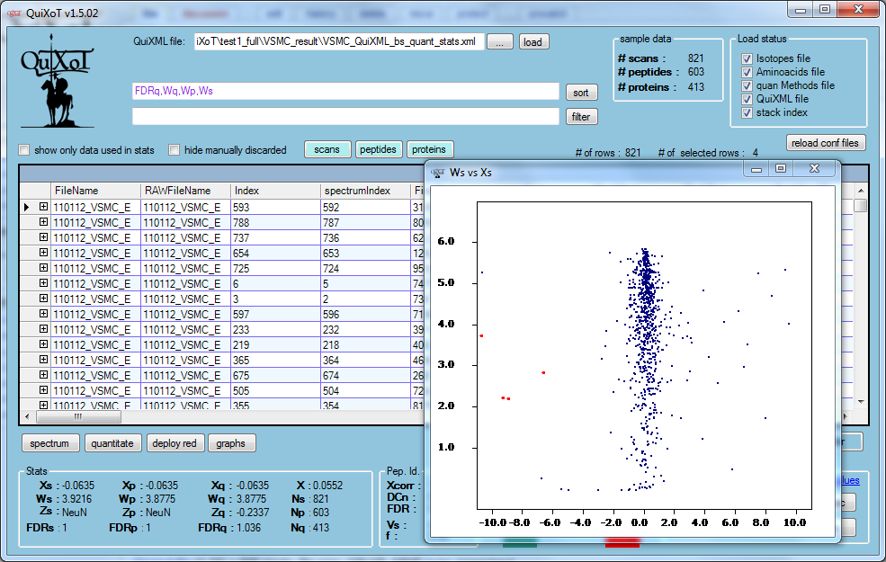
If you now zoom out in the graph (right click > zoom out), you will see these dots highlighted against the rest of the datapoints:
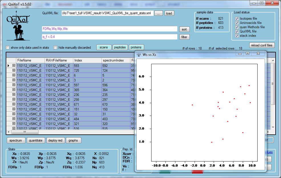
Now, instead of a filtering the datagrid using the graph, we will filter using the filter field. Let's assume we want to check the behaviour of poorly labelled peptides; for that, we will apply the filter q_f < 0.4 and then click on the button filter. We should get something like this:
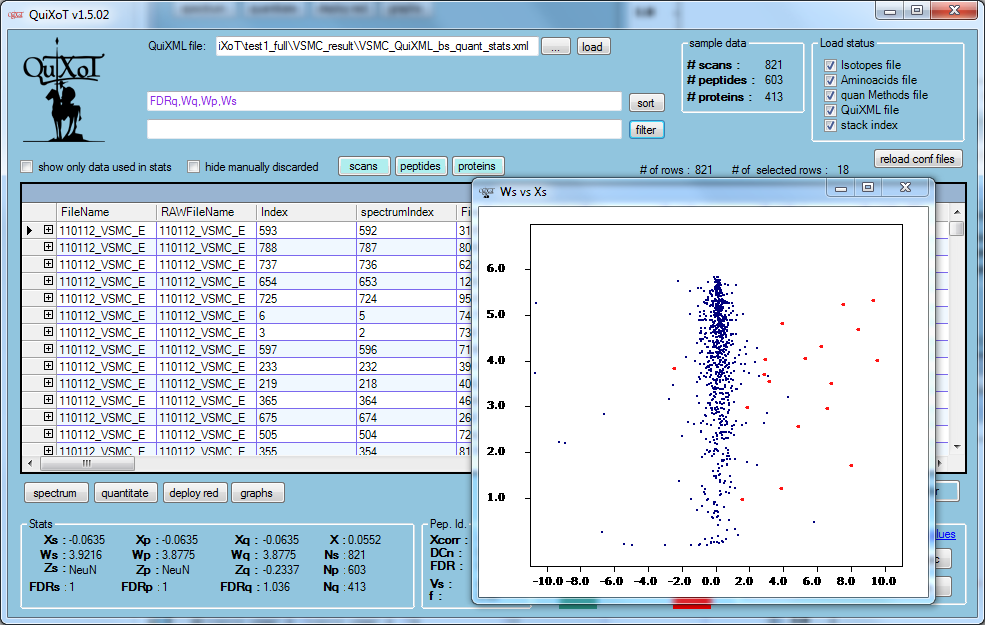
To compare these peptides with the bulk of data, we can remove the filter (empty the filter field, and then clik on filter), and the refresh the graph (right click > refresh graph), so we get this:
Now we can see easily what is the behaviour of the poorly labelled peptides compared to the rest of peptides.
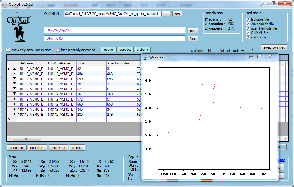
Now we will check which scans are quantifying differently, compared to other scans pointing to the same peptide. This is done by applying the filter FDRs < 0.05 (using a 5% FDR). After selecting, we should have this:
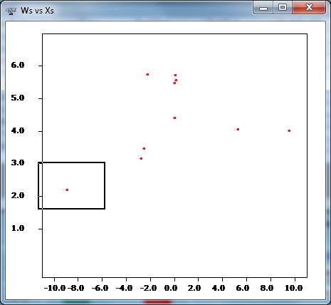
If, for example, we want to see the leftmost of these scans, we can select it with the mouse,
Now QuiXoT should show us only the row containing that datapoint:
Notice how the filter colour changed from purple to green. This is to tell us that two filters are being used at the same time: the zoom filter and text filter.
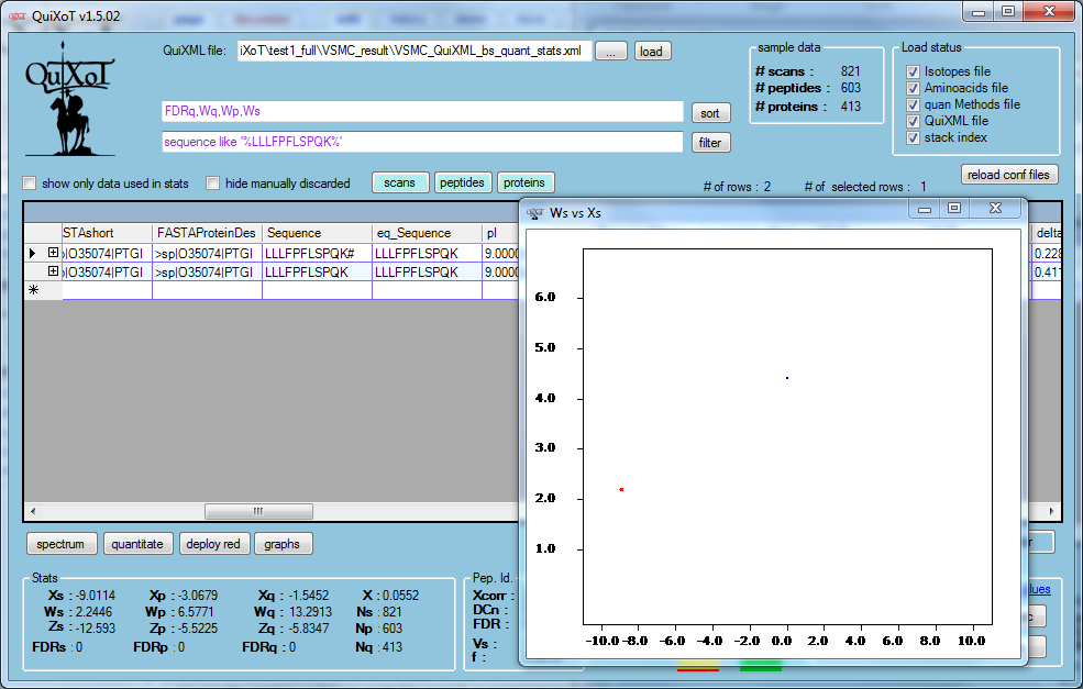
We will now filter out all the spectra pointing to the same peptide; we can do this by using the texto sequence like '%LLLFPFLSPQK%':
Apparently two spectra are present.
Combining spectra and data graphs
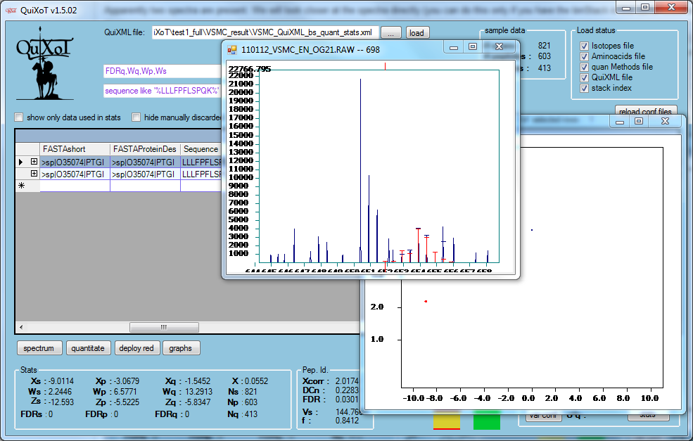
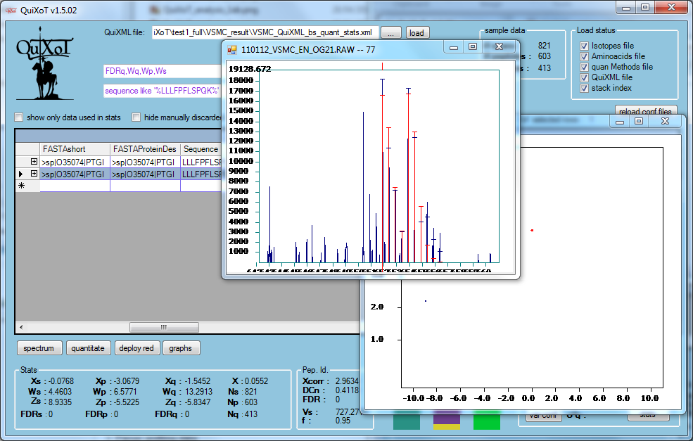
We will take a closer look at the spectra directly (you can do this only if you have the binStack in the same folder as the QuiXML), just by selecting the rows (on the left).
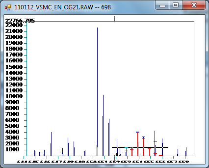
It looks like the first one is a bad quantification. We will zoom that region of the spectrum (by selecting horizontally, as we have seen):
And, yes, it seems a bad quantification:
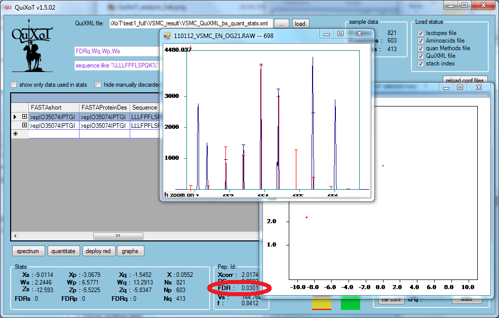
We have highlighted the FDR value in the identification panel: it seems the reason of the bad quantification is that this was a bad identification; it had an identification FDR of 3%, with an XCorr = 2, which is relatively low, while the other spectrum pointing to the same peptide (see above) had been identified with 0% FDR and a higher XCorr = 2.96.
Combining different graphs
We will now check the peptides quantified in every spectrum, and the difference between comparing them to other scans, and comparing them to other scans after centring the population of scans within the peptides to which they are pointing.
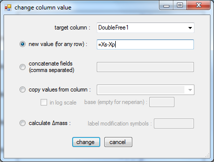
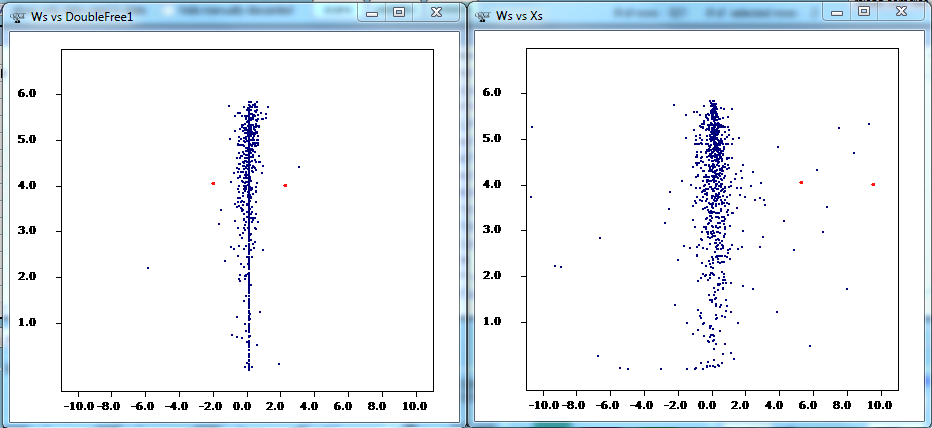
To do this, we use one of the columns reserved for calculations, DoubleFree1, by storing there the quantification of a scan (Xs) relative to the quantification of scans pointing to the same peptide (whose relative abundance is defined by Xp):
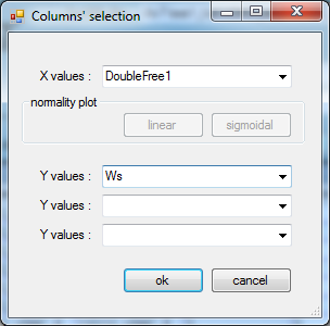
Then, we represent this result:
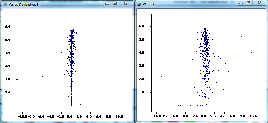
And we compare both graphs:
- left is (Xs - Xp) vs Ws
- right is Xs vs Ws
If we use filters as we have seen to select the two spectra where peptide GHYTEGAELVDSVLDVVR has been identified (using the filter sequence like '%GHYTEGAELVDSVLDVVR%'), we can see how they look compared to other centred quantifications:
(The central vertical line here is the set of peptides that have been identified with only one spectrum, hence their Xp = Xs, and Xs - Xp = 0).
Analysing the three levels at once
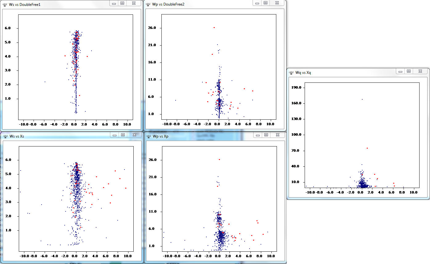
By using the features that have been explained above, we can generate three graphs at once, so they interact with each other:
- Ws vs Xs
- Wp vs Xp
- Wq vs Xq
Then, we can check how a specific group of proteins behave. For example, all the proteins containing the text "tubulin" in the description (their FASTA header). We can do this by filtering FASTAProteinDescription like '%tubulin%', selecting the whole set of rows, removing the filter, and updating the graphs:
Here we have added the centred graphs for spectra and peptides (see above how we did this for spectra; for peptides this is done similarly by storing Xp-Xq into DoubleFree2).
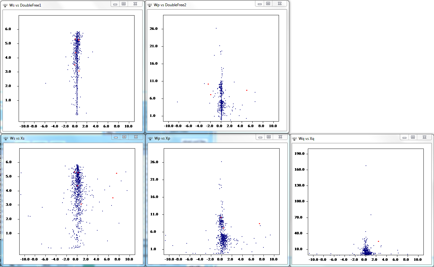
We can see that tubulins seem to be overexpressed (rightmost graph). We see peptides are changing both at the scan level (bottom left) and peptide level (bottom centre) accordingly, and we know this is not an artefact, as centring the scans to the peptide values and the peptides to the protein values, we get few changes (the two top graphs), with the possible exception of two peptides (which can be investigated independently by selecting them, if needed, but we will not do it in this example).
We can select a specific tubuling with the mouse (select with mouse, select rows, click on graph > zoom out, click on other graphs > refresh graphs), so we obtain the following:
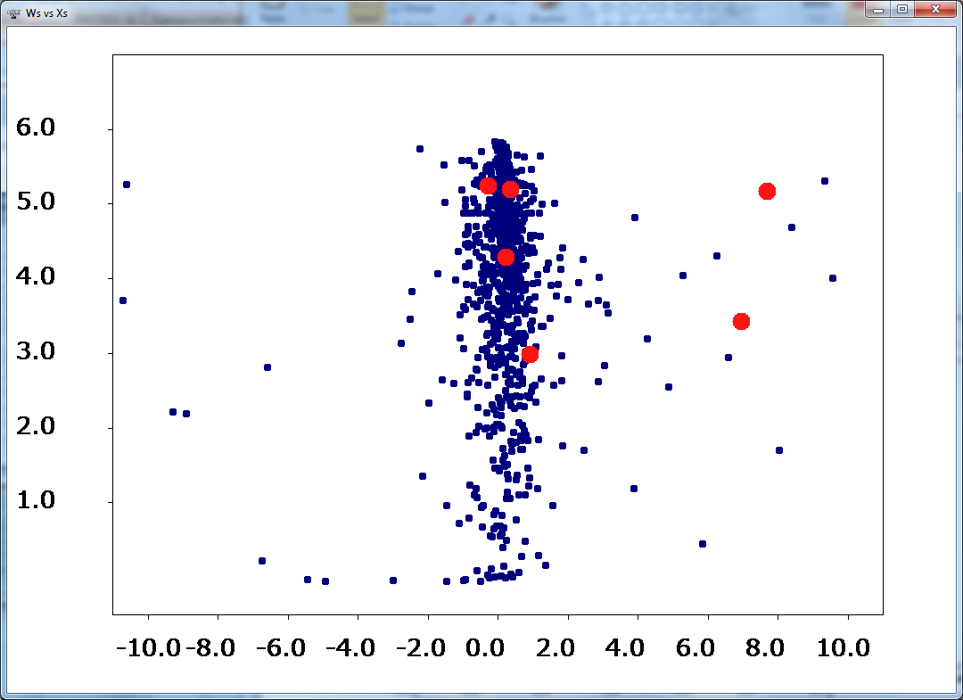
We might be interested in checking these spectral information better by enlarging the graph. If the datapoint are not seen well, or we need better resolution for a publication, we can rightclick > toggle dot size:
Or alternatively right click > export to csv, and represent the data using another software. Doing this, the whole QuiXML is saved in table format, including in the last columns the data from the concerning graph.
Notes
- ↑ Fields containing NaN (or similar, as NeuN, depending on your system language) mean the contents of the field is not a number (this happens with proteins having only one peptide or peptides identified only with one scan, as the calculation of Z involves divisions by zero for these cases.


